One of the best conversion methods is to create exceptional landing pages.
Landing pages are a powerful tool to capture leads by focusing on a specific page using lead-capture forms. Without them, the promotion of targeted pages would have been a lot more challenging to achieve.
So, to create a landing page that will be both simple and successful, you need to pay attention to the details that will shape it into a fantastic conversion tool.
Websites vs. Landing Pages
To clarify things, landing pages and websites are not the same thing. Take a look at this graphic below. Can you spot the differences?
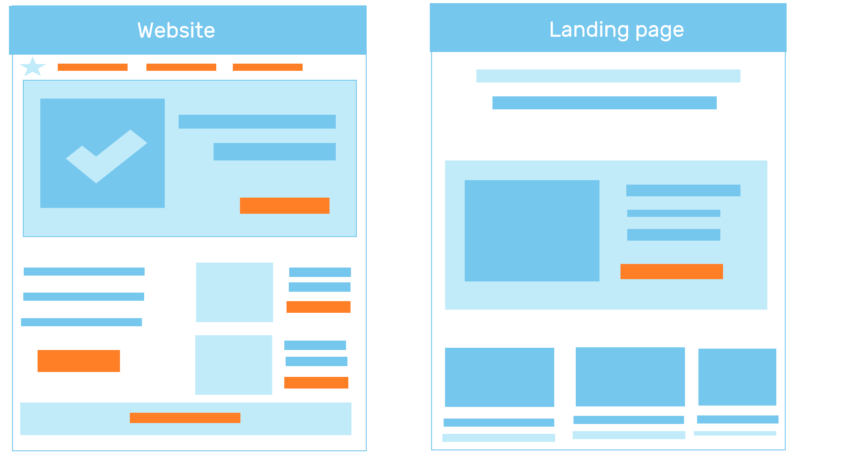
A website can be easily recognized by its multiple CTA’s and key characteristics:
- Navigation
- Blog Section
- Distracting Text
These multiple CTA’s enable the visitor to navigate your site and explore its different features. Compared to websites, landing pages do not have multiple CTAs and are used for lead generation.
To achieve this, landing pages must be simple enough to give a clear call-to-action that the visitor will instantly take without getting distracted.
Now Let’s See 7 Simple Tips To Make The Best Landing Page Out There:
1. Keep it Simple and User-Friendly
Landing pages are successful because they can deliver a single CTA most effectively.
Bills.com does a fantastic job of simplicity and adds an element of interactivity.
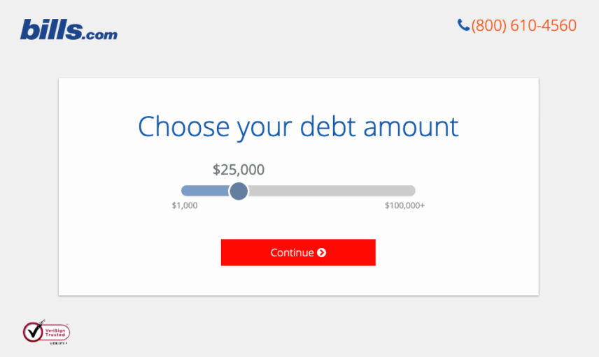
A page that is full of irrelevant links and information that has nothing to do with the purpose of the landing page is out of the question.
A simple user experience can undoubtedly simplify the visitor's process of taking that call of action you need to boost your brand, make the sale, sign a new user, capture a lead, or complete any other conversion you're trying to have them fulfill.
Moosend's complete guide is another great place to learn more about creating simple and successful landing pages.
2. Give Information About the Target Product
If you look around the web, you’ll find numerous landing pages for similar brands.
To make your landing page stand out, you need to have attractive elements that will assist the presentation of the product.
A terrible template and poor presentation can have a massive impact on click-through rate and conversion. So, what you need is to add little pieces of information that will help sell the product better.
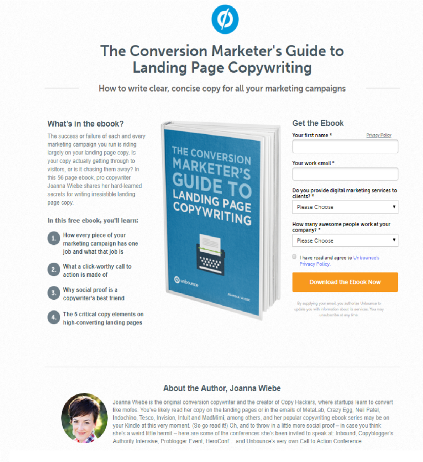
For example, to make an ebook work on a landing page, you need to consider whether you can judge it by the cover.
The answer is no.
A summary of what’s inside can make an ebook landing page more credible and informative, leading the visitor to download it instantly instead of trying to find more information about it.
See how Unbounce’s ebook provides all the necessary information before downloading?
3. Include Social Proof
Social proof was, is, and will be one of the most successful tactics to boost a product since 91% of consumers trust online reviews as much as personal recommendations.
Social proof can take the form of several trusted buyers who used the product and now recommend it to a new visitor.
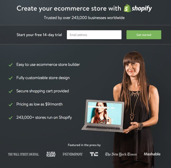
For instance, Shopify’s 243,000 trusted businesses provide users with a trusted e-commerce store service for future visitors.
Social proof like this works because people feel that the product they are going to buy has been tested and approved by others.
If several businesses or individuals worldwide trust and use a specific brand, then the user will ask himself, “Why don't I?”
Since people tend to choose products that have reviews or are approved by brands with authority, being credible is one of the most critical factors in turning awareness into action.
Regardless of the form, social proof is a great way to build credibility and trustworthiness, eventually leading to higher conversion rates.
4. Offer X-Day Trials
Your users don’t want to end up paying or signing up for something they didn’t get the chance to test. That’s when trials come in to save the day.
Trials are an excellent source of promoting and boosting your sales with free samples of a product. And, when full-featured trials appear on landing pages, they allow users to sign up and take a look at the product themselves instead of relying on user reviews.
With a clear call to action and a free entry without commitment, landing pages that include trials can create a temporary conversion that can become permanent.
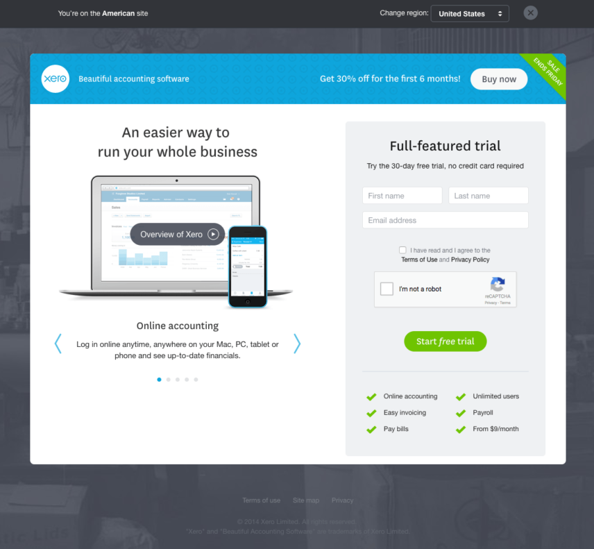
Xero’s no-commitment trial, for instance, can do the trick and generate more leads.
5. A Splash of Color
Individual connections between specific colors and brands have opened up another aspect of marketing that focuses on the psychology of color.
So, what that teaches us is that the right color combination between your background and CTA box can be a decisive factor when it comes to achieving higher conversion rates. CTA’s must be visible at first glance because they are the reason the whole landing page was created in the first place.
When planning the perfect landing page, remember that a brighter and warmer box contrasting with the background will be easier to spot and click on.
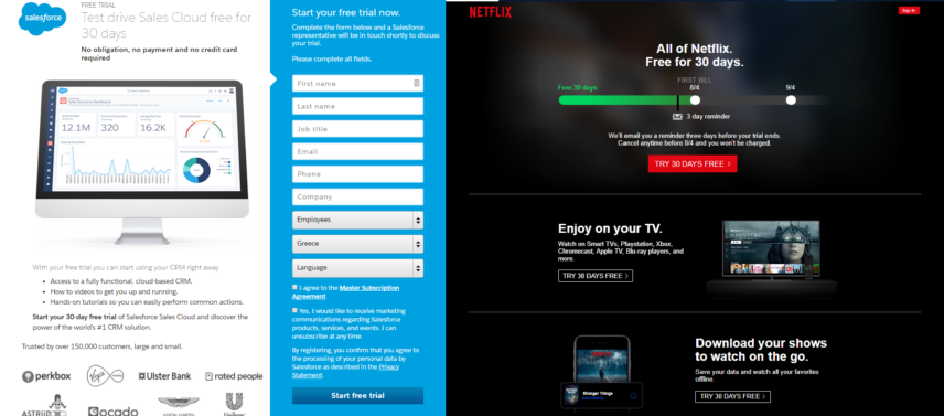
Netflix, for instance, has managed to create a red CTA with a clear call. However, when you look at Salesforce’s blue CTA, you can see it stands out less than Netflix’s bright red. Paired with a 30-day trial, Netflix’s CTA is hard to miss.
6. Have an Attractive Headline
Having an attractive call to action isn’t the only thing that affects the success of your landing page.
Headlines are one of the things that will magnetize the user and make him click on your link. Writing the perfect landing page headline depends on the target audience and the product itself.
However, the most crucial thing to keep in mind is whether it is clear enough for the visitors to get your message and attractive enough to lead them to conversion. Successful headlines offer solutions to a problem and show genuine concern for people.
The more personalized your headlines are, the more successful they’ll be since they will be able to provide the visitors with a product that you made, especially for their needs.
Freshbooks manages to give the visitor what he needs by providing a solution to a problem.
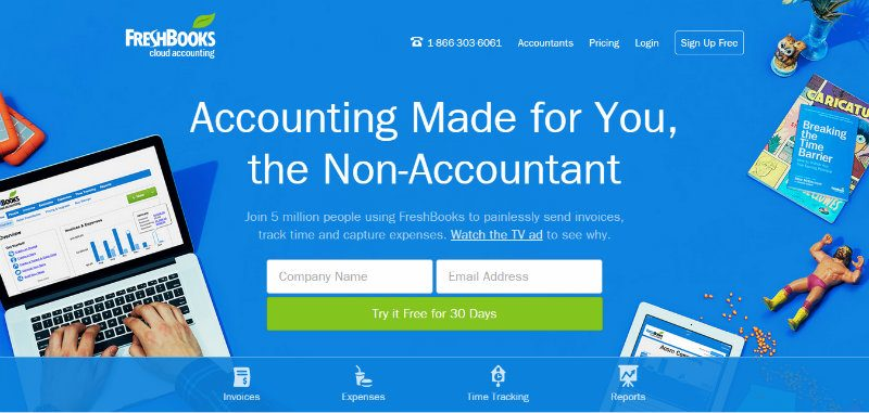
Paired with social proof, the headline gives out the promise that you, the non-accountant, will be able to do accounting.
7. Use Background Images
Images are a powerful means to make any content super attractive. The perfect background image can shape a simple landing page into a powerful means of conveying emotions that lead to conversion.
Such images will not only be a nice touch to assist your landing page aesthetic, but they will provide a look into what the user will gain by clicking.
By adding a visual trigger, the landing page becomes more relevant to the product without becoming tiring and distracting.
Now, if you take a look at Airbnb’s couple, you’ll see two people holding a piece of fabric.
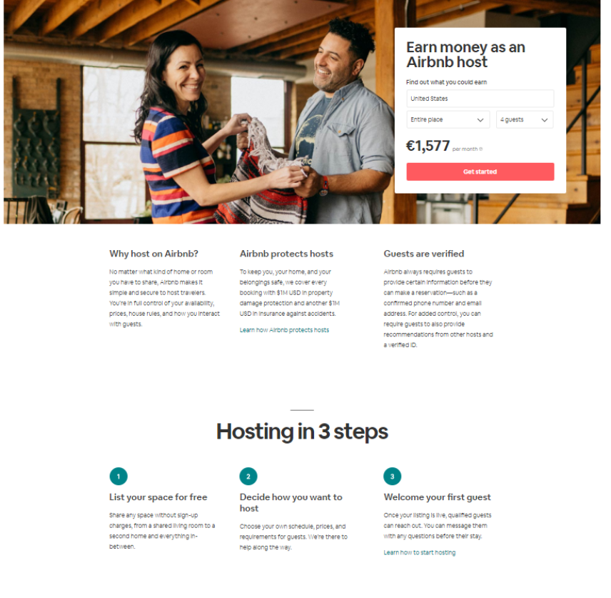
Visitors, though, see past the image and start thinking that they could be the couple, enjoying the advantages of becoming a host.
8. Consider Landing Page Builders
If you’re unsure about how to design a good landing page or don't want to build one from scratch, landing page builders are an easy way to get started.
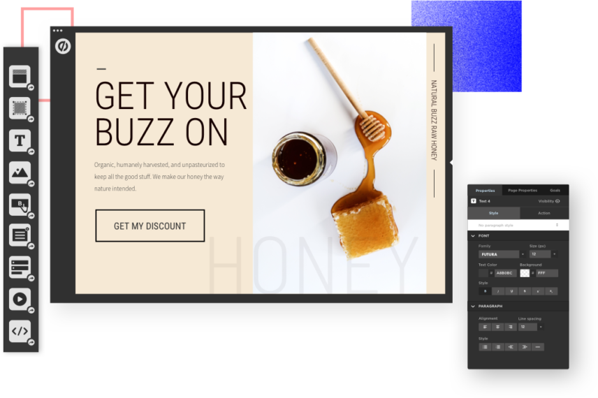
By far, my preferred landing page builder is from Unbounce, pictured above.
Landing page builders are the simplified versions of website builders. Their purpose is to help you create pages that compel visitors to take action, whether signing up for an email list, filling out a contact form, or making a purchase.
Landing page builders make it effortless for you to create a fully customized landing page that looks professional with no need for coding or design skills. While you can still insert custom code in some, most landing page builders require no coding knowledge whatsoever. What's more, landing page builders are fast, and you can have a new landing page up and running in very little time. In addition, you can iterate your pages quickly, test different versions, and see what works best for your audience.
There are many landing page builders on the market that differ in terms of complexity, customization, and features. Make sure to test your options and choose the best one for you.
Keep an Eye Out for Performance
When you start building or tweaking your landing pages, you shouldn’t forget to establish your key performance indicators (KPIs) to help you succeed.
Analytics can offer you the chance to correct and improve mishaps that keep your conversion rate from rising. When you develop your pages, you should study your bounce rate, CTR, and exit rate.
If everything’s running smoothly, then there’s nothing to worry about. However, if things don’t go so well for your brand, you should:
- Analyze your bounce rate and come up with better dynamic pages that will result in more clicks.
- Monitor your CTR and optimize your page by highlighting the benefits and rewards of your product.
- Figure out what influences your exit rate and adjust your content to match your target audience’s needs better.
- Consider running an A/B split test to see which design factors increase conversions even more.
The Takeaway
In conclusion, we saw that these simple yet crucial tips could turn a landing page into a powerful tool to boost your conversion rate.
When you create the perfect destination page, you should plan and figure out all the small details that will make it work.
A clever title and simple lead capture form can indeed improve UX and encourage visitors to stay on your website and buy your product.
So, next time you start planning your landing page, don’t forget to pay attention to all the small details that can make a difference and benefit you greatly.