Email newsletters have come to be one of the most essential marketing tools worldwide. And, since users tend to check information about products through emails, it’s no wonder why it is the road to success.
The use of standard single-column templates can be a good choice. However, reaching out to a professional email service provider like Moosend, Mailchimp, or Aweber can make things a lot easier as they can provide you with a variety of specific templates.
Followers need to feel like the center of the product. And, to achieve that, they most certainly don’t want to receive a generic and boring email, which might instantly go to their deleted folder.
Your email newsletter needs to have character. It’s not a simple tool, but rather a living thing that needs to play a crucial part in your marketing strategy.
So, how can you design the perfect email newsletter that will be creative, engaging, and lead to conversions?
1. Simplicity is Key
Imagine receiving an email where the content is too complex or hard to focus on. What would you do? That’s right. You’d hit delete instantly.
Simplicity is key when designing the perfect email newsletter.
Scrolling down to find complex images and text that makes no sense to your target reader is not helpful at all.
It needs to be consistent and include all the relevant information that will engage your audience and cause zero frustration.
Getting ideas from creative presentations is also a little design hack that goes a long way!
Also, having a default style that you can easily adjust according to your needs can have a significant impact on your open rate.
In some cases, it doesn’t even need to be fancy. Even emails written at a 3rd-grade reading level can do the trick.
2. Set your Goals
Designing the perfect email newsletter doesn’t mean that you’ll have to find the most expensive or fancy email service provider.
Having a clear idea and goal can make things easier and bring you one step closer to the ideal email newsletter.
If you search the market, you’ll be able to find a plethora of Mailchimp alternatives like Moosend to help you out. Email marketing is undoubtedly one of the most straightforward marketing strategies you can find and implement.
It all comes down to what you have in mind and how you will materialize it.
3. The Right Color Aesthetics
Speaking of color, your email newsletter design should be able to catch the eye of the reader and be aesthetically pleasing.
Contrasts between specific colors can have an effect that will discourage subscribers even to take a look.
Keep in mind that although black and white might be a match, other colors like yellow and blue might not work as desired.
4. The Right Template for the Right People
Having a target audience will help you leave out the layouts that won’t fit with your brand.
Let’s say you have a clothing line like Forever 21 and you choose to have a very monochrome and strict template. Since Forever 21’s target audience is mainly young people, you will immediately have created something that will seem a little odd compared to what they are used to receiving.
The layout and template should be able to match the target audience and make it feel included.
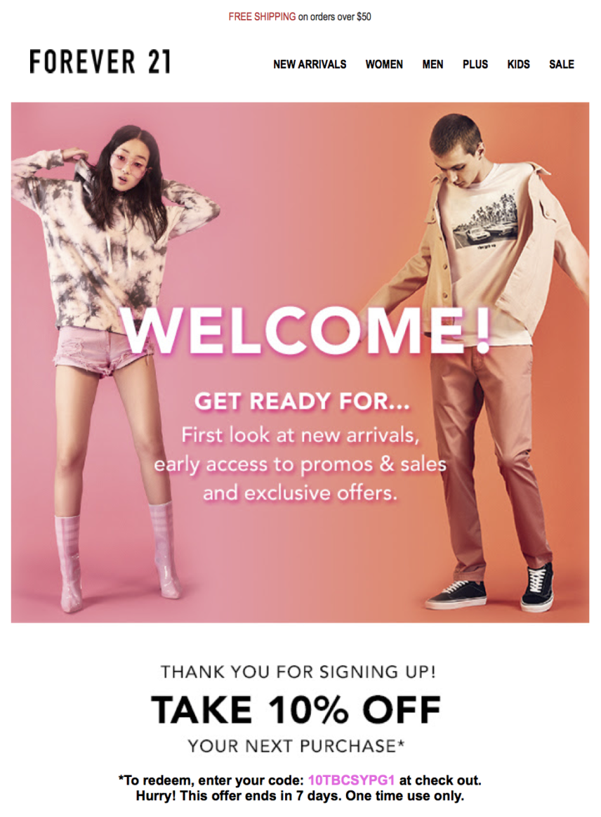
Take, for example, one of Forever 21’s welcome newsletter emails above. From the models to the color palette used, you can see that it promotes something young and fresh without being too much to handle.
5. Fewer Complex Fonts
Less is always more. In this case, a chaotic or too complex font can create significant issues to your email newsletter.
Your message to your audience should be straightforward and easy to digest. The brain should be able to take in the information with a glance without struggling or spending too much time.
"Readability", says Kyle Nordeen “is a score that tells you the reading level needed to easily read a piece of text.”
Complicating texts with weird-looking fonts can cause major confusion leading to less engagement.
What you need to keep in mind is, “Can a ten-year-old read it without complaining?” If yes, then you’re on the right track.
These are your best bets for sans serif fonts:
- Arial
- Arial Black
- Tahoma
- Trebuchet MS
- Verdana
These are your best bets for serif fonts:
- Courier
- Courier New
- Georgia
- Times
- Times New Roman
6. A Picture is Worth a Thousand Words
When you choose the right email marketing software, you should be able to balance text with images. Images are one of the most powerful media to convey a massive amount of information in a single shot.
Users generally like to see images when they receive newsletters, especially when it comes to tangible products. However, there is also a large number of them that will disable them if they don’t load fast or they have nothing to do with their needs.
In this case, you should consider using an image that will support your content, and it will not be there only for promoting purposes or stylistic effects.
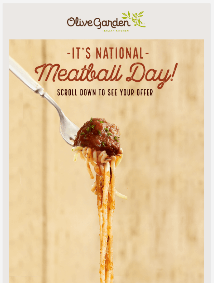
Images can indeed improve user experience and give insight. Plus, they have a higher social share chance. Olive Garden surely knows how to make it work.
7. Optimize Mobile Accessibility
If you think about it, cell phones are the only means of communication that people have in their pockets at all times. So, it is only natural that 75% use their smartphones most often to check email.
That means that the perfect email newsletter should be accessible through different means of communication. Using mobiles is the best alternative to check various pieces of information fast.
That’s when optimization for mobile accessibility comes in. Desktop content and mobile content should exist separately. Applying the same template for both can cause problems with user experience.
Look at Foodtown’s newsletter, for instance. The massive volume of products and information makes it unable to navigate.
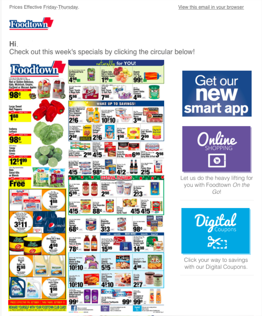
If text or images fail to be mobile-friendly, then that can be an instant ‘no’ from your subscribers.
8. Subject Lines Matter
To have the best subject line, you have to give your audience something memorable and unique. A clever and catchy title can always be successful and attract interest.
It has, though, certain drawbacks that you should keep in mind. Titles that appear shady or as clickbait can be flagged as spam.
Avoid special characters and all caps to reduce the chances of being flagged. And, your titles should be able to attract attention without getting caught in spam.
Many email campaign providers have A/B testing options for subject lines. Play around with your subject and make sure to send some test runs as well.
EngageBay shows the best email subject lines that get opened and read. It's definitely worth a read!
9. Know your Audience
Knowing what your audience wants is the best way to create a newsletter that will be equally personalized and informative, along with having well-thought techniques to generate sales, as that is typically the primary goal.
Spending resources and using your email automation marketing tools to create something that will be irrelevant or indifferent to your audience’s needs is not worthwhile.
Being strictly promotional and impersonal can discourage your audience, so you have to put yourself in their shoes and think whether you like what you received or not. If the answer is ‘no’ then you have to re-evaluate things.
Thinking and planning ahead can help you come up with amazing content that will not only expand your email newsletter but also keep your subscribers satisfied.
10. Staying Relevant
Having up-to-date content is the best way to build and maintain engagement.
People need to be updated regularly about your content, but be careful because there is a line between healthy newsletters and spamming.
According to Adobe’s Consumer Email Survey, 45% of people found getting emailed too often pretty annoying, so you should pay attention to the number of emails you send to a subscriber to avoid ending up in their spam folder.
By having a regular and informative email newsletter, you will be able to build up interest and expectations for upcoming products. As a result, your effort will slowly lead to creating a loyal community that will support you.
Keep in mind, though, that failing to update a newsletter regularly can also cause disengagement.
11. Listen to Feedback
Being open or not to feedback and user recommendations is what impacts the success or failure of an email newsletter campaign.
If you show your audience that their opinion matters to you, you can easily start building a loyal subscriber basis that can benefit your brand long-term.
Creating a circle around your email newsletter will transform it from an anonymous list to a user-friendly subscriber-oriented community that will thrive.
To Sum Up
There are many tips that will help you design the perfect email newsletter, but in the end, it comes down to what you want to achieve. A sales approach will be slightly different than a newsletter geared to be informative.
By paying attention to the details and by employing these tips, you will provide your audience with an excellent user experience. And, you will surely be one step closer to higher open rates on your quest for the perfect email newsletter design.
