Right now, someone is shopping online. Well, it would be more accurate to say that hundreds of thousands of people are shopping online right now. Heck, I bet one of your browser tabs has something you're considering buying or evaluating for purchase.
Every online shopper is a sale or conversion waiting to happen. But, all too often, the shopping experience ends suddenly at the checkout stage, and the transaction is lost.
Now, some of those conversions were never going to happen in the first place. The shoppers were likely only browsing. While they may have put a few items in their cart, they were only digitally window shopping.
However, a fair amount of those customers were prepared to finalize their purchase. They had sent a few items to their shopping cart, headed to the checkout page, but changed their minds at the last moment. Why?
The checkout process itself is the likely culprit.
Perhaps it was too confusing. It might have been too invasive, asking for personal information the customer did not care to provide. It may have been clumsily designed, forcing the customer to jump through too many hoops to complete the transaction.
A poorly designed checkout can severely impact e-commerce conversion rates. Therefore, it's critical to take stock of your checkout process and optimize it for a better user experience.
Let's look at a few simple fixes that can make your checkout page a conversion factory.
Understanding the Customer's Journey
This first point doesn't directly discuss conversions, but we need to start with a few questions.
- Have you taken the necessary steps to define your audience?
- Who are your buyers? Age? Male or Female?
- What are their primary interests?
- Where else do they shop?
You need to understand your buyer and where they are in the purchase phase.
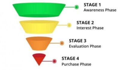
Sales funnels do a great job of helping define each phase and typically look like this one.
Awareness can be done through paid advertising such as Adwords, social media marketing, events & trade shows, and blog posts. In addition, you're helping the visitor understand your market or niche of products.
With the interest phase, your customers are interacting with your posts through comments, liking your social media posts, and generally learning even more about your company. They're engaging with your content.
The customer might request a sample, look at your reviews, and understand the colors and sizes available in the evaluation. Then, they're just one step away from purchasing.
And finally, the purchase phase equals a sale or conversion.
Getting to the purchase phase directly is almost always done through brand recognition. Your visitor knew precisely what they wanted through a brand name search and purchased what they were looking for.
Are there ways to help you get to the purchase phase faster? Yes.
Answer Customer's Questions Early and Often
Shipping costs and taxes are two of the most frequently asked questions online shoppers have. Do you offer free shipping? Make sure it's well known early on.
Think about it from your perspective. How often have you been shopping online, found an item at what you thought was a great price, put it in your shopping cart, and proceeded to the checkout only to find that the shipping costs wiped out any potential savings? What did you do? Like most people, you abandoned the cart and went looking elsewhere for the same or similar product.
Shoppers want to know about shipping costs, taxes, and any other transaction fees upfront. Don't hold them back until the final phase of the transaction. Unexpected shipping costs or expenses are one of the primary reasons shoppers abandon a purchase. Post any transaction fees upfront, and repeat them throughout the checkout process.
That's not to say you can't offer "better" shipping options on checkout, like next-day air and up-sells. However, your website visitors need to know exactly what to expect and not be surprised by any additional costs.
Registered Buyers vs. Guest Shoppers
It's always tempting to want to gather as much information about your customers as possible. It helps your target advertising and creates a better shopping experience for people visiting your site.
But, not all shoppers are comfortable giving out their personal information, and many do not want to register with a retailer to make a simple purchase. It is always a good idea to include a guest checkout option that will allow shoppers to complete a transaction without creating an account with your company.
Simplify the Checkout Process
The simpler and more streamlined the checkout process, the more likely your customers will complete the transaction. Use an auto-fill feature, so customers do not have to fill in shipping and billing information when the information is the same. Reduce the number of clicks it takes for the customer to complete the transaction.
If possible, create a single-screen checkout form. If not, keep the number of clicks required to complete the checkout process to a minimum. Chewy.com is an excellent example and has an easy-to-use one-step checkout process.
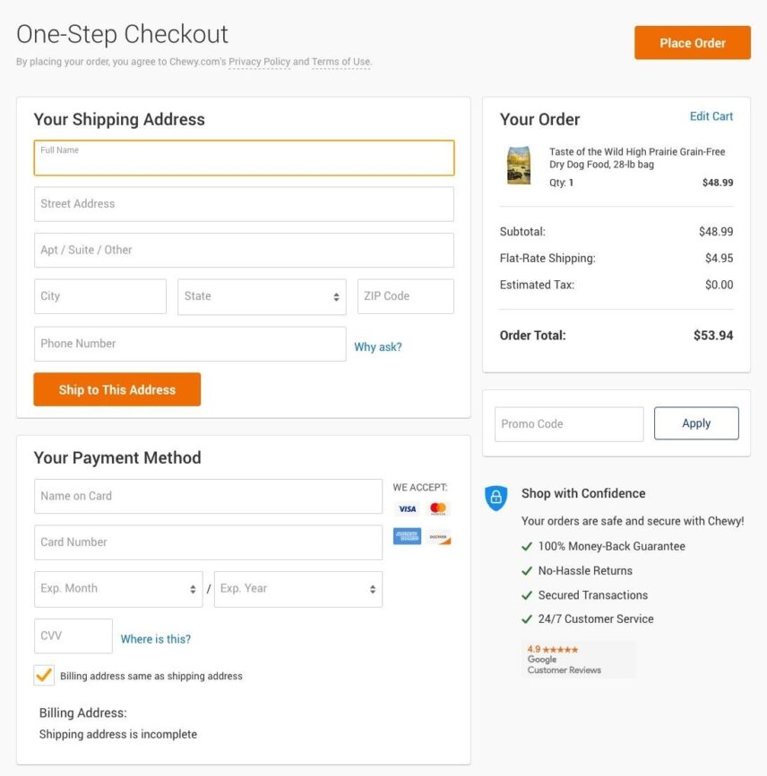
Remember, every time that next page loads, your customer can change their mind and abandon the process.
If you're using Woocommerce, you might consider further optimizing your checkout process by eliminating or adding fields by adding the Checkout Field Editor extension.
Advertise Your Site's Security
Shopping online is fast and easy, but it is also impersonal. Customers never really know who they are dealing with and who has access to their financial information.
Make it a point to display your site's trust seals prominently. For example, a survey done by Baymard shows that people trust Norton and Verisign the most.
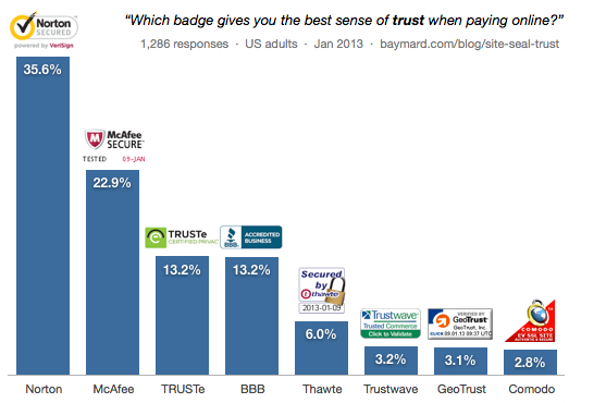
Advertising that your site's transactions are secured will tell your customers their financial and personal information is protected and that your checkout procedures are secure.
Make sure to show your SSL status as well. People love feeling safe.
Save Your Customer's Abandoned Carts
If a customer abandons their cart during checkout, that does not necessarily mean the conversion is lost. It may only be delayed. Using cookies, you can ensure that the next time the shopper visits your site, the items they were interested in will still be in their cart, ready for checkout.
There are also excellent solutions to help with cart abandonment. One of the best ways is while you still have the visitor on your site through exit intent pop-ups.
If it is a registered customer, you might consider sending a friendly email reminder that their purchase is ready for completion. Once the transaction is completed, you can send a thank you email that features other items that the customer might be interested in purchasing at a later date.
Wrapping Up
The checkout area can be the most important place for any e-commerce site. It is here that customers either complete their purchase or click away, leaving the conversion incomplete.
By creating a simple, easy-to-understand, and speedy checkout process, you can reduce the number of abandoned shopping carts and improve your overall conversion rates.
