Every website has a purpose. Most often, that purpose is simple -- to increase sales.
And your website isn’t just a collection of pages and posts; it’s the digital heartbeat of your brand. It's your 24/7 salesperson, online ambassador, and the bridge connecting you to countless potential customers.
To make your website stand out (and quite honestly, not get any Google penalties these days), you need to roll up your sleeves and dig deep into the art and science of website enhancement and an intimate understanding of the user experience (UX).
1. User Experience (UX): Crafting Intuitive Digital Journeys
In the world of digital real estate, your UX is like the layout of a physical store. A thoughtful layout guides visitors effortlessly, making them feel at home.
A cluttered, confusing website? Your visitors will be out faster than you can say "back button."
But here's the thing: optimizing UX isn’t just about the visitor's convenience -- it's about creating a memorable journey, ensuring every click, swipe, and hover feels intuitive and rewarding.
How can you help your UX?
Making Mobile-First a Priority
Gone are the days when web surfing was reserved for desktops. It's actually difficult to believe that many websites (ahem, I'm looking at you, government sites) still don't have a mobile-first website experience.
With growing mobile internet usage, having a mobile-friendly site is no longer optional. Ensure your website is optimized for mobile experiences:
- Implement responsive design - Website layouts should adapt seamlessly to fit desktop, tablet, and mobile screens.
- Check site on mobile devices - Test the user experience directly on smartphones and make improvements.
- Optimize checkout for mobile - Simplify checkout with Apple Pay, Google Pay, and other seamless payment methods.
- Limit pinching/zooming - Avoid the need to zoom in and out by using appropriately sized buttons.
- Load speed matters - Slow mobile load times hurt conversions more than on desktop.
In today's fast-paced world, prioritizing mobile optimization is a must. It's critical to think of web design layouts that look as good on a 5-inch screen as on a 15-inch one.
Speeding Up Page Load Times
In today's world of instant gratification, waiting for a webpage to load feels like an eternity. Ensuring your pages load fast means optimizing page load times so visitors aren’t left tapping their fingers in impatience.
About 5 years back, many web developers rushed to set up websites on Google's AMP framework to increase website speed. That was a colossal waste of time, and most of those sites have been reverted to standard responsive sites.
With content delivery networks and newer content management systems (CMS) becoming increasingly faster, many other ways exist to shorten page load times, such as:
- Compress images - Use tools to reduce image file sizes without sacrificing quality. This speeds up load times.
- Minify CSS, JavaScript, and HTML - Minifying removes unnecessary characters and shortens file sizes for faster loads.
- Implement caching - Caching stores assets and pages to serve faster to repeat visitors. Effective caching cuts down load times.
- Optimize web hosting - Use optimized cloud and web hosting, content delivery networks (CDNs), and compression to accelerate performance.
- Remove unnecessary plugins - Avoid unnecessary plugins that slow things down. Streamline only essential tools.
Those are just a few examples you can do to increase page load times and enhance your website for your visitors.
Clear and Intuitive Navigation
A good website navigation structure is like a well-laid-out map. It should guide the visitors, showing them how to find what they're looking for without getting lost in a maze of links and buttons.
Spend the extra time to build out your information architecture (IA) in a well-organized manner with a clear breadcrumb structure for visitors and search engines.
Adopting a Clean Design Approach
While showcasing everything you've got is tempting, restraint and focus can lead to a visually pleasing and more effective user experience.
Beauty in simplicity is the mantra.
2. Call-to-Action (CTA): Guiding Visitors Towards Purposeful Actions
Imagine you're at a crossroads, and a friendly guide points you to the best path forward. That's your website's CTA. Your visitor needs to know what to do next immediately when they arrive at your website.
However, it's not just saying "click here" or "buy now." It's about making a compelling proposition about what you want the visitor to do and, more importantly, what they will receive in the process.
Harnessing the Power of Compelling Language
Words matter. They can inspire, entice, and motivate. Crafting CTAs with the right tone and emotion can be the gentle nudge that visitors need.
Convey your core value proposition clearly throughout the customer journey. Key elements include:
- Headline and subheadings - Use inviting headlines and subheads to convey your value proposition.
- Hero images/videos - Visuals like banners and videos that highlight your differentiators.
- Benefit-focused content - Clearly explain your benefits in your copy on all site pages.
- Unique positioning - Share what makes you stand apart from competitors.
- Solve pain points - Demonstrate how you address customer pain points through a portfolio of work.
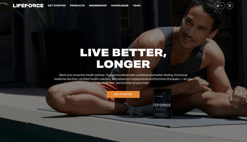
Let's look at an example. Lifeforce is a popular website in the growing biomarker testing industry.
Here is their current CTA on their homepage's hero button:

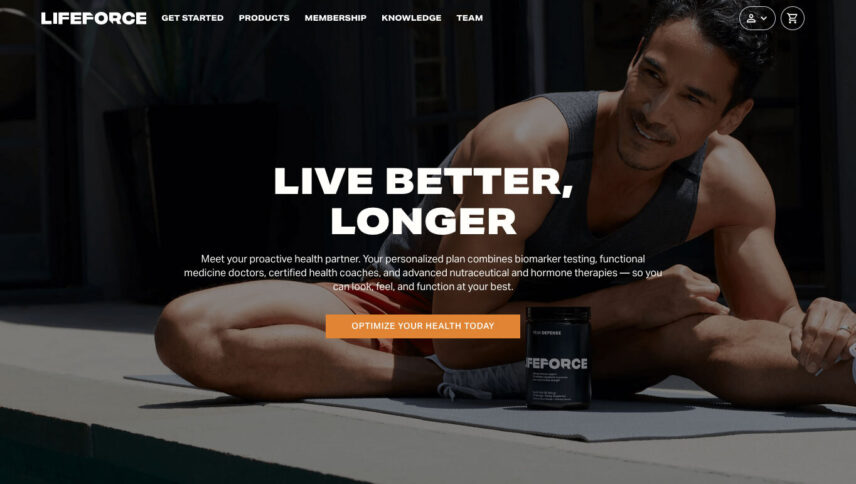
But what does "Get Started" mean? What if, instead, they changed the button text to the following?

Of course, "Optimize Your Health Today" sounds much more inviting and has a clear call-to-action.
But A/B testing is crucial to get messaging dialed in -- more on this below.
Maximizing Visibility for Easier Engagement
It's crucial for CTAs to stand out, not hide in plain sight. Strategically placing them, using contrasting colors, and playing with design can ensure they command attention.
In my opinion, increasing the button size would also help with the Lifeforce example. I do love the bold orange color!
Simplifying Choices to Enhance Decision Making
Offering choices is good, but overdoing it can be counterproductive. By streamlining options and presenting clear CTAs, you ensure your visitors aren't overwhelmed but rather, feel empowered.
For other examples of CTAs, check out Nice Very Nice -- a site dedicated to curating beautiful designs.
3. High-Quality Content: Engaging Minds and Hearts
Think of your website as a digital storyteller, narrating the story of your brand, products, or services.
The content is its voice -- melodic, persuasive, and informative.
High-quality content sets you apart in the ever-growing landscape of the internet, with millions of voices vying for attention. But what does "high-quality" mean?
It’s content that resonates, speaks directly to a need or a desire, and is fresh and highly relevant.
Let's unravel the layers of crafting such content.
Crafting Clear and Relatable Copy
Every word you write should resonate and strike a chord. Ok, maybe not every word. But it's definitely about marrying information with emotion, making visitors nod in agreement or smile in surprise.
Incorporating Rich Media to Elevate the Narrative
A picture is worth a thousand words, and a video? Possibly a million. Use vibrant visuals, engaging videos, and crisp infographics to weave an engaging narrative.
Avoid stock photography like the plaque. Search engines know stock photography from custom images.
Staying Fresh with Regular Content Updates
Keep pace by regularly refreshing your content, whether blog posts, product updates, or news, ensuring you remain relevant and top-of-mind.
That post you wrote in 2015 -- are there clicks to it anymore? Regular content audits are a must.
4. Social Proof: The Digital Word-of-Mouth
Remember the last time you tried a new restaurant because a friend recommended it?
That's social proof at work. In the digital world, it works similarly.
Positive testimonials, glowing reviews, and success stories build trust and amplify your brand’s credibility. In a space where screens replace face-to-face interactions, social proof becomes your ambassador of trust.
Amplifying Voices with Reviews & Testimonials
Let your satisfied customers do the talking. Real, unfiltered reviews offer a transparent look at what you offer, building trust and nudging potential customers.
Spotlighting Trust Badges for Added Assurance
Badges from reputed organizations or certifications can serve as stamps of approval. They tell your visitors, "Hey, we're legit, and others vouch for us!" -- make sure to include your TrustPilot, Google Reviews, Clutch, or any relevant industry badges on your website.
Narrating Success Stories that Inspire
Who doesn't love a good story? Especially one that showcases real-life benefits derived from what you offer.
Use detailed case studies or success tales to illustrate your impact. Many websites bludgeon about their great services, but people don't care.
People want proof, and that's where case studies shine to nudge people to interact with your brand.
5. A/B Testing: The Digital Experimentation Ground
The digital realm offers a unique advantage -- the ability to test, tweak, and tailor your website's enhancements to your visitors.
And that's what A/B testing is all about. It's not about making wild guesses but about making informed decisions based on real user behavior. It's like offering two flavors of ice cream and seeing which one gets more takers, then refining the recipe based on feedback.
Experimenting with Page Variations for Insights
Two versions, one goal -- to see which variant performs better. Whether it's a change in imagery, wording, or layout, A/B tests offer insights into visitor preferences.
You definitely want to think in terms of smaller variants. Too many variations are next to impossible to track. KISS applies here.
Identifying Focus Areas for Effective Testing
Not everything needs testing. Prioritize elements that directly influence user decisions, like button CTAs, callouts, headlines, and product images.
For one client, we found that simply changing the button CTA color from green to orange had an uptick of over 108% in conversions! However, using color theory in design showed that green should have been the appropriate color -- it was wrong, clearly.
Interpreting Results for Continuous Enhancement
Numbers and graphs paint a story. Dive deep into testing results, draw insights, and then loop back to refine, ensuring your website remains a lean, mean, converting machine.
Without web development knowledge, A/B testing can be daunting at first. Alternatively, heatmap tools such as Hotjar or Microsoft Clarity are a great place to dip your toes into evaluating user behavior.
However, don't run these tools indefinitely. Get the data you need for decision-making, then turn it off, as its "load" on your website can be very heavy.
6. Customer Support: Being There When They Need You
Imagine visiting a physical store and having no one to answer your queries. Frustrating, right?
Websites are no different. Customer support is the bedrock of building trust. It reassures visitors that behind the digital façade is a real team, eager and ready to assist.
By making customer support accessible and visible, you're sending a clear message that you're there for your customers.
Integrating Live Chat Features for Real-time Support
In an age of instant gratification, live chat bridges the gap between questions and solutions. It offers visitors a quick, interactive platform to resolve doubts without navigating away.
However, returning to mobile-first for a second, a chat feature might not be needed on your website's mobile experience. A prominent phone number, through a "footer navigation" bar, could get customers the instant answers they need.
Removing chat on the mobile responsive state can also help decrease page load times.
Placement of Contact Information
While this may sound basic, you'd be surprised how often contact information is buried in a sea of pages. Having your company email and phone number prominently displayed is akin to saying, "Give us a shout anytime!" and further encourages top-tier customer support.
Multichannel Support for Broader Outreach
Different folks, different strokes. Some prefer emails, others DMs on social platforms, and yet some others might lean towards traditional phone calls. Offering varied channels ensures you're always reachable.
At a bare minimum, ensure you have an easy-to-find contact form on your website.
7. SEO Optimization: Leading Visitors Right to Your Doorstep
The digital world is vast, and standing out in this ever-expanding universe is challenging.
That's where SEO (search engine optimization) plays its part. It's the digital equivalent of a lighthouse, guiding potential visitors right to your shores. By optimizing your website's content, structure, and meta details, you enhance its visibility on search engines, making it easier for your target audience to find you.
Keyword Integration for Targeted Traffic
Words are powerful, especially when users type them into search engines. Integrating relevant keywords ensures you're in the spotlight when potential customers seek your offer.
Search intent is key. You must optimize your website's content appropriately and use SEO tools. Snag a free trial on SEMRush and learn how to optimize the keywords you're targeting.
Optimizing Meta Descriptions for Improved Click-Through-Rate
Do you know that small snippet of text under your website's title in search results? It can make a world of difference. Crafting compelling meta descriptions can lure users into clicking, increasing your site's traffic.
And while Google has publicly denied (for decades) that they don't evaluate click data, recent news exposed what most of us in the SEO industry knew through relatively simple experiments -- they DO use click data.
Crafting compelling meta descriptions and, of course, your meta titles help with CTR (click-through-rate).
Ensuring High-Quality Backlinks for Enhanced Credibility
Backlinks are the digital equivalent of word-of-mouth among websites. When reputed sites link to yours, it's like getting a thumbs-up in the online community, boosting your SEO value.
Backlinks are still the holy grail of SEO. When sites link to you, those links from authoritative sources create trust signals.
8. Analytics and Insights: The Art of Understanding Your Visitors
In the grand theatre of the internet, your website analytics is the director, constantly observing your visitors and their website events. Delving deep into analytics helps you understand user behavior, track conversion paths, and identify potential bottlenecks.
Analytics is about making sense of the numbers and shaping and reshaping strategies based on real, actionable insights.
Monitoring Real-time User Behavior for Live Insights
By watching user activity in real time, you can gauge what’s working and what’s not. It’s like getting a sneak peek into your visitor’s thought process.

The graph above shows the basic User Acquisition channel in Google Analytics 4.
If you're looking for a deep dive into custom GA4 insights, I highly recommend Andy's article on Google Explorations.
Setting up Conversion Tracking for ROI Evaluation
Every action on your site, be it a form fill-up, a product purchase, or a newsletter subscription, has value. By tracking these conversions, you can measure the true ROI of your digital strategies.
Regularly Reviewing and Adjusting Based on Insights
The digital realm is fluid and ever-changing. Regularly diving into your analytics, interpreting the data, and making necessary adjustments ensures your website remains optimized for maximum conversions.
Most people set and forget their analytics without paying much attention to the data. It's imperative you use your analytics data to continually create better experiences for your users.
9. Trust and Security: Building Digital Fortresses of Credibility
In this age of cyber threats and data breaches, online security isn't just a technical requirement; it's a testament to how much you value your visitors' trust.
Every padlock symbol, every SSL certificate, isn't just a tech feature. It's a beacon, signaling your visitors that their data and privacy are safe. Ensuring your site is secure is like building a digital fortress that protects both your brand's integrity and your visitors' trust.
Implementing SSL Certificates for Secure Browsing
An SSL certificate encrypts the data flow between user browsers and your server. It's the equivalent of sealing a letter before sending it, ensuring prying eyes stay away.
I wrote a full-featured article on common SSL errors and how to fix them -- I invite you to explore that article.
Regular Site Backups and Updates for Prevention
The digital landscape is ever-evolving, with new threats emerging daily. Regular site backups ensure you have a contingency plan, while periodic updates keep potential vulnerabilities at bay.
While backups don't necessarily fall under UX or website enhancements, we all need friendly reminders to backup, backup, backup!
Besides, if you make a large change with your A/B testing or otherwise, having clean backups could be a lifesaver.
Showcasing Privacy Policies Transparently
In a world where data is gold, showcasing a transparent privacy policy is about honesty. It tells your visitors exactly how their data is used, reinforcing trust.
In Google's ever-moving target towards E-E-A-T signals (expertise, experience, authority, trust), I strongly believe having a privacy policy on your website speaks heavily to a component of the trust signals they're after.
10. Feedback Mechanism: The Loop of Continuous Improvement
And finally, the voices of your visitors carry invaluable insights. They're the end-users, the ones navigating your digital terrains. By establishing robust feedback mechanisms, you're not just collecting critiques or praises; you're building bridges, fostering dialogues, and turning one-time visitors into lifelong advocates.
Integrating Easy-to-Use Feedback Surveys
Gathering feedback shouldn't feel like a chore to your visitors. Simple, intuitive surveys invite more responses, providing you with richer insights.
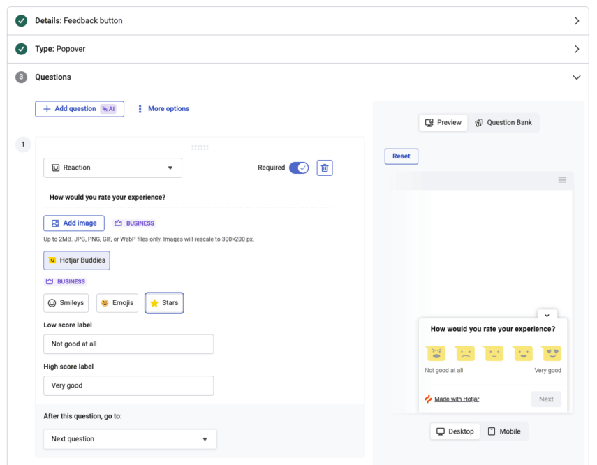
Hotjar, once again, is a great place to start with adding this feature. Their interface is clean and simple, as you can see below.

Don't overwhelm customers with too many unnecessary fields. Only gather the minimal information critical to get the data you need to adjust the user's journey.
Actively Seeking Reviews and Suggestions
Don’t wait for feedback; seek it. Active outreach through emails, pop-ups, or social media polls can provide a wealth of information to refine your offerings.
Exit-intent pop-ups are an excellent means to collect visitor feedback. Learning more about your visitors and their likes (or dislikes) is valuable.
Then, create and showcase their reviews on a unique page of your website. Google loves user-generated content (UGC), and reviews are the lowest-hanging fruit in this category. Implementing a comments system on your articles is another great way to collect feedback, but it can come with additional work for website monitoring.
Of course, you can always direct your visitors (and you should) to your Google Business or other review sites for additional trust and social proof signals.
Analyzing and Acting on Collected Feedback
Collecting feedback is just the first step. Sifting through it, identifying patterns, and implementing changes is where the real magic happens. It’s an ongoing cycle of improvement.
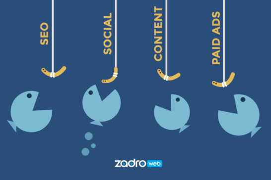
And don't be afraid to use AI in your website enhancement processes. Adobe Firefly generated the hero image in the article!
Artificial intelligence has so many powerful features to help curate your ideation process -- don't sleep on it!
Conclusion: Turning Pixels into Potential
The internet is a kaleidoscope, ever-shifting, ever-evolving.
Ensuring your website stands out in this dynamic panorama is both an art and a science. From the intricacies of UX design to the nuances of feedback collection, every tweak and every enhancement is a step towards building digital experiences that resonate, engage, and convert.
But remember, in this journey of continuous improvement, your compass is your visitor!
Listen to them, learn from them, and let them guide your path. Here's to unleashing the potential of your website, turning pixels on a screen into tangible, impactful potential.
And by all means, feel free to reach out through our contact form to learn more about how Zadro Web can help you turn your visitors into connections, have them become your best online ambassadors...and, of course, increase sales for your company.


